
The problem
A coach with a real following needs her website to do the converting.
- Visitors arrive from social media and need to trust her in seconds.
- Free value should lead somewhere: an email, a booked event, a conversation.
- Most visitors are on phones.
NovaMind's AI Career Mentor, the product behind this site's waitlist, has its own case study: NovaMind AI Career Mentor. Both were designed for the same client.
My role
Product designer, end to end on the website. I designed the pages, the components and the mobile layouts, in under a month.
The process
01 · Define
Two decisions shaped the site.
- Free resources are the magnet. A visitor gets something useful first, and gives an email to unlock it.
- Events show their seats. A progress bar and a "Fully booked" state create honest urgency, without fake countdowns.
02 · Design
01 · Convince
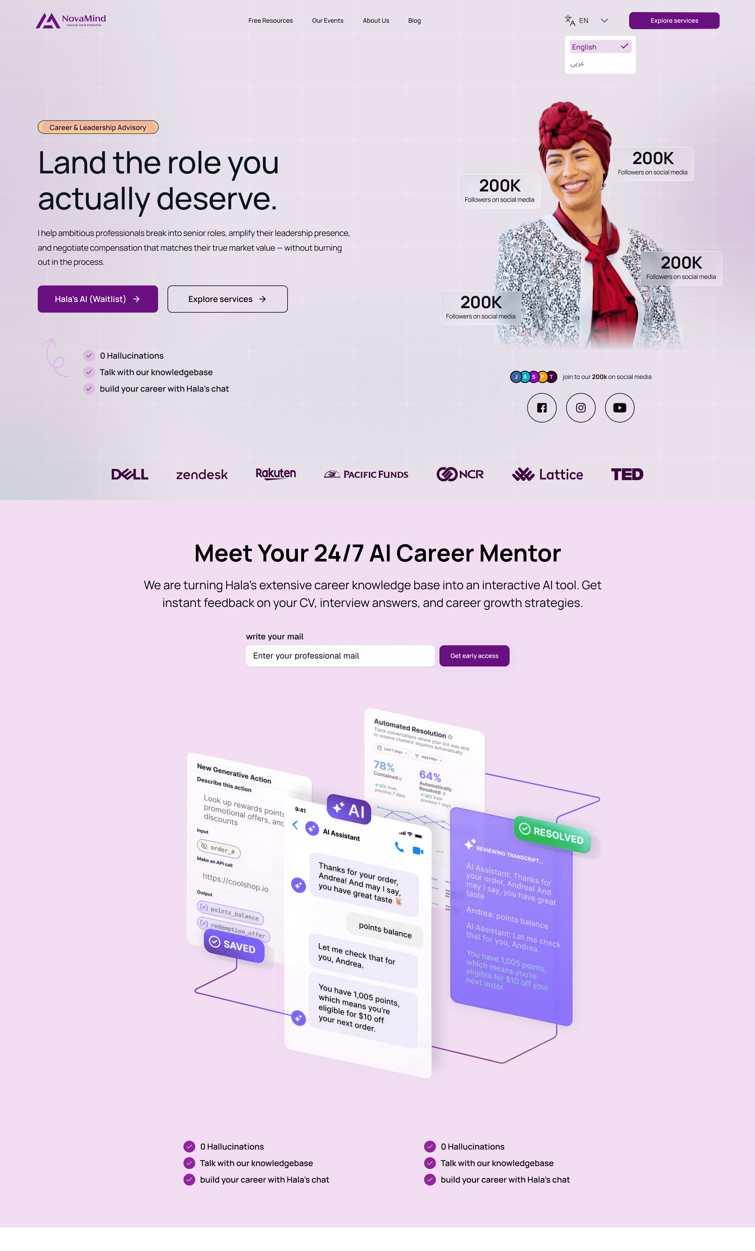
A landing page that starts with a person
Lead with the coach, then the offer.
- A clear promise and two actions in the hero.
- The AI mentor section connects the site to the product.
- Services, a free toolkit teaser, and the founder's story close the page.
02 · Learn
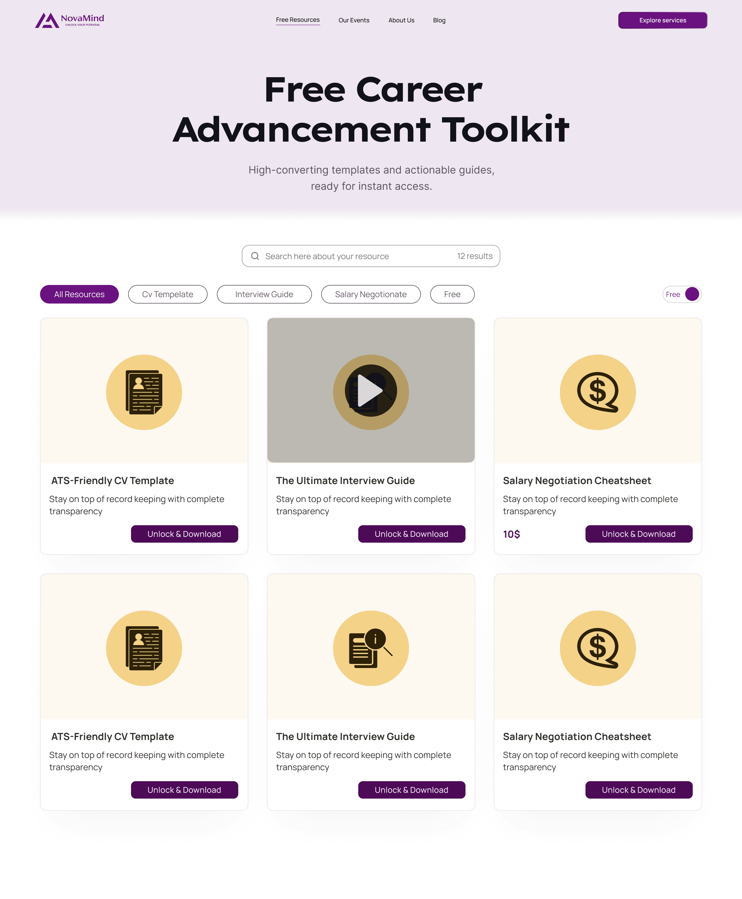
Free resources that earn an email
A library people can scan.
- Search and filters by resource type, plus a free toggle.
- Cards with an icon, a title, a short line and one action: Unlock & Download.
- A short form asks only for an email, and an embedded video player supports video resources.
03 · Join
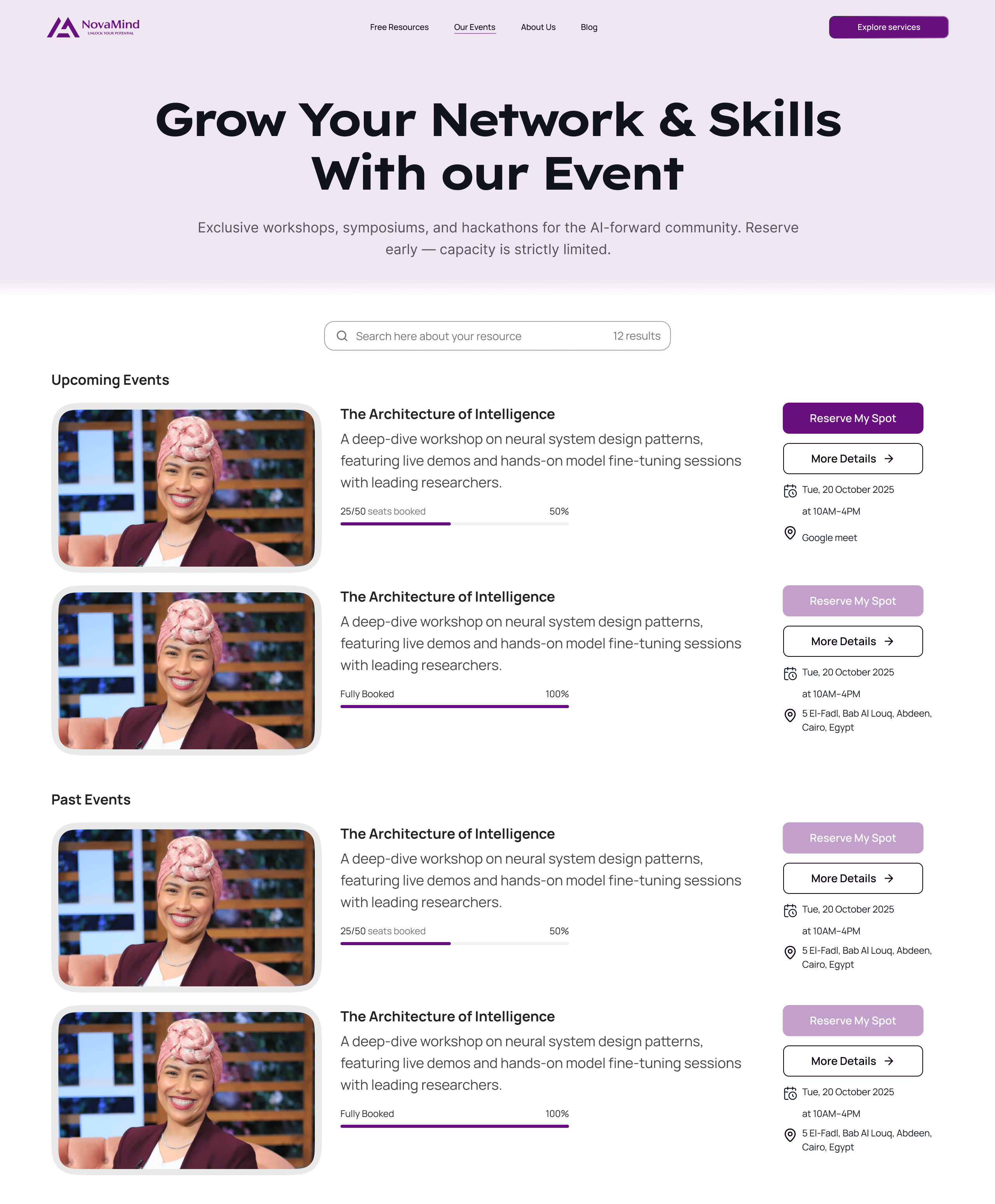
Events with seats you can see filling up
Reserve in two steps.
- Seats booked shown as a bar: "25/50 seats booked."
- Fully booked events keep their page, with the action disabled.
- Event details show date, time and place or link before the visitor commits.
- A one-field form sends the private link by email.
04 · Trust
Our story, told by the founder
Credibility on its own page.
- The story, the founder's background and what NovaMind offers, in three clear blocks.
05 · Mobile
The same site, rebuilt for the phone
Mobile is a layout of its own.
- Sections reorder and stack instead of shrinking.
- A navigation drawer keeps the main actions one tap away.
- Cards and forms are sized for thumbs.
03 · Hand off & ship
- Pages, states and components prepared in Figma for development.
- Live at novamind.org.
The live site has evolved since the design: its copy and some sections were updated afterwards. The screens here are the design as I delivered it.
What I learned & what's next
- Give before you ask. Free resources made the email request feel fair.
- Show real scarcity. A seats bar says more than a banner.
- Next: measure how many resource visitors leave an email, and how many event pages turn into a reservation.
Stack & tools
Design
- Figma
- Responsive layouts (1280px and 393px)
- Reusable cards and form components