

The problem
New mothers get too much sleep advice, and none of it is a plan.
- Advice conflicts. Every source says something different.
- No day-by-day structure. "What do I do today?" has no clear answer.
- Specialists are hard to reach. Mothers need human guidance at the right moment.
The product: an app where mothers track their baby's habits (sleep first, then feeding and daily life) and can consult doctors and specialists.
My role
Product designer. I designed the experience for the mobile app: the plan, the daily schedule, consultations and content, in Arabic RTL.
The process
01 · Discover
Understand what mothers need at 3 a.m.
- A tired parent needs one next step, not a library.
- Trust matters more than features: the content comes from a sleep specialist or doctor on the team, with scientific references.
02 · Define
A plan first, tools second.
- Phases, not a pile of tips. A sleep plan runs in order, so the design does too: each phase unlocks the next.
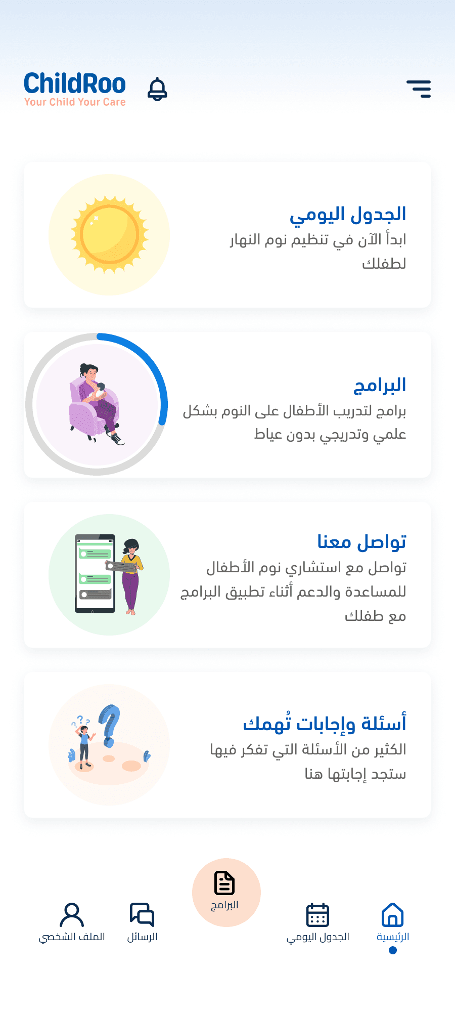
- One hub. Plan, schedule, consultations and learning sit in one bottom navigation.
- Safety by design. Plan screens carry a clear notice that the plan doesn't replace a doctor's advice.
03 · Design
Six flows, each answering one question.
01 · Personalize
From a few questions to a plan
"Is this plan for my baby?" Answered in a few taps.
- A few multi-choice questions about the baby, then "your plan is ready".
- The home screen shows the baby's profile and age, so the app feels personal from the first minute.
- A short "how it works" with a tip sets expectations before the plan starts.
02 · Follow
A plan in phases
Each phase has a goal, a duration and ordered steps.
- Locked phases build focus. The next phase stays locked until the current one is done.
- Each phase has three tabs: overview, plan, next.
- Phase 1 builds the nap schedule. Phase 2 covers independent sleep, reducing night feeds, and notes on how the mother feels.
- A step indicator shows where you are inside a phase.
03 · Track
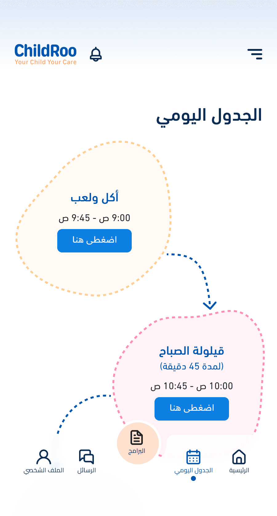
Today's schedule, one tap at a time
The schedule shows the current activity and the next one, as a path.
- A bedtime checklist keeps the evening routine to a few clear tasks.
- Home shows phase progress in a ring, then a check when it's done.
- Done and not-done states are explicit, so a tired mother never has to guess.
04 · Consult
Ask a specialist
Human help inside the same app.
- A guided tooltip tour explains the screen on first use (1 of 5, 2 of 5).
- A clear empty state with two actions: start a consultation, or browse common questions.
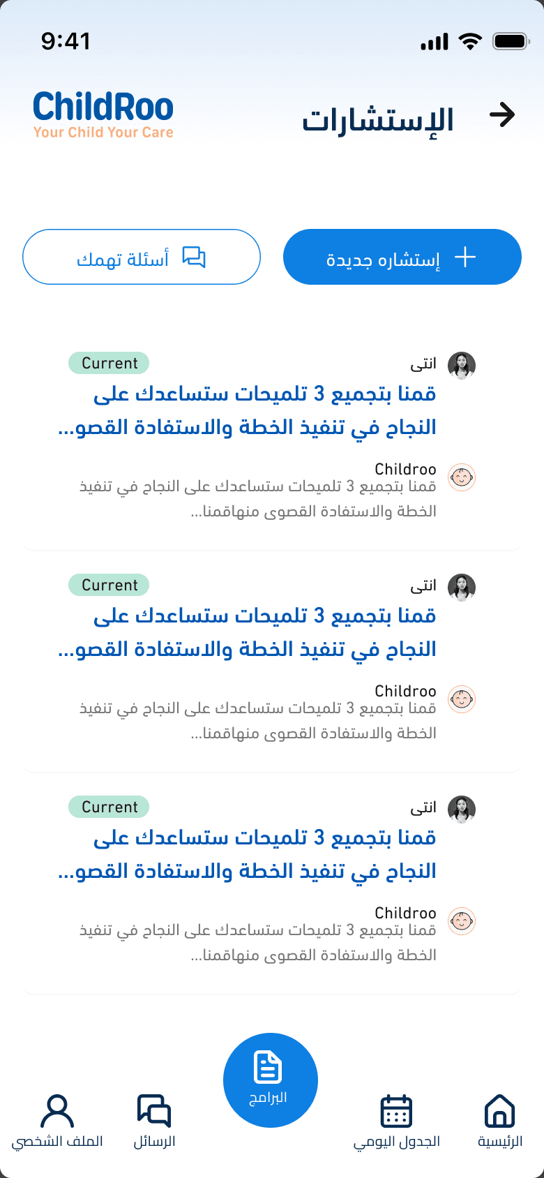
- A simple chat with the specialist, and a list that shows which conversations are current.
05 · Learn
Content mothers can trust
Learning content built on evidence.
- A sleep program for ages 0–3 months, with video and topic cards showing reading time and read count.
- Every article ends with "Was this helpful?", so the team learns what works.
- A scientific references page makes the specialist's claims checkable.
06 · Iterate
What changed after review
Reviews changed the design in three places.
- Home: illustrated cards became photo cards, a more real and trustworthy first screen.
- Quick Action: three options explored, from logging a wake-up time to a daily streak to a task checklist.
- Phase 1: simplified into a locked-phase plan with tabs.
04 · Hand off & ship
- Screens, states and components prepared in Figma for developers, including Arabic RTL behavior.
- Tasks tracked and handed off in ClickUp / Notion / Jira.
- Shipped on iOS and Android.
05 · Validate
The design was reviewed by four groups before handoff:
- Real mothers
- The sleep specialist / doctor
- The client (product owner)
- The developers
Results
- 200K+ downloads across the App Store and Google Play.
- Live on both stores.
- 3-phase plan that unlocks in order.
- Designed in 1–3 months, from first flows to handoff.
What I learned & what's next
- A plan beats a feature list. Mothers don't want more tools, they want to know what to do today.
- Trust is a design material. References, specialist review and safety notices did more for credibility than any visual polish.
- Next: measure how many mothers complete Phase 1, and use the "Was this helpful?" signal to improve content.
Stack & tools
Design
- Figma
- Arabic RTL layouts
- Reusable cards and phase components
Collaboration
- ClickUp / Notion / Jira (tasks and handoff)
Product
- iOS & Android app
- Specialist consultations
- Evidence-based content with references